Design, Web Development Responsive Websites and Embracing Mobile Development
Charlie Chauvin — October 14, 2015
Before responsive design, life was all margaritas and moon pies. It use to be common place to design a home page and a sub page, then hand it off to the developer and they could build exactly what you mocked up. You clicked through all the pages on your desktop computer, made adjustments and your site was ready to launch. However, as more and more people got their hands on smart phones, tablets and various internet devices, we slowly started seeing a shift. New clients started coming through the door that wanted their website to be responsive while existing clients started wanting a separate mobile solution to complement their existing site. With several methods on the table, It was a struggle at first because there wasn’t a clear path for how all sites would be handled moving forward. We had in-depth discussions about responsive design strategy and went through a handful of trial and error to figure out what was our best approach and rebuilt our process.
Responsive Web Development Takes Finesse
At this point I don’t need to convince you that responsive web design is the way to go. You probably have a smart phone in your pocket right now and know that if you pull up something on your phone and it takes too long to get what you need, you are going to get really frustrated and move on.
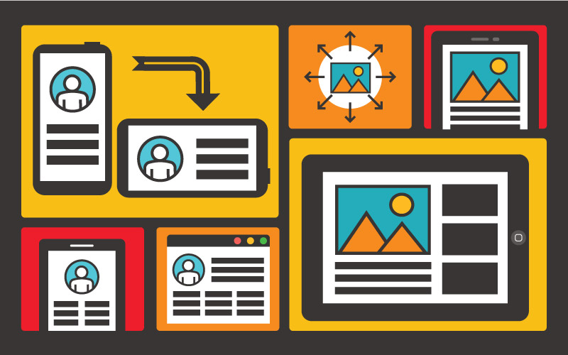
Often, what most people don’t realize is the care that it takes to make sure your website doesn’t fall apart at various screen sizes. Desktop monitors are generally horizontal, phones are mostly vertical and tablets tend to be both. You would think that a horizontal layout could just squeeze itself into a vertical layout, but sometimes it’s not always that easy because the content breaks and doesn’t always look good. Users also interact differently on a phone using one hand vs sitting in front of their desk where they tend to have more flexibility and patience. All that being said, there are a lot of things that go on behind the scenes and it takes a lot of practice to get it right.
Common Design Problems with Flexible Layouts
- Font sizes need to be adjusted as page scales.
- Header and footer navigation needs to be customized so that it is usable on desktop and mobile, depending on how many pages your site has.
- Spacing and margins needs to be adjusted until it feels comfortable for reading.
- Items that are horizontal on desktop may need to adjust to a vertical format on mobile.
- Images may need to be set at a smaller size so they load faster on mobile.
- Some things may need to go away on mobile versions if they interfere.
Responsive Frameworks to the Rescue
A responsive framework is a set of basic prebuilt structural elements that we use all the time, that help us build faster. Look at it this way, if you have you ever been to the hardware store and walked down the lumber aisle, there are several sizes of beams, panels of wood, posts, etc. You don’t have to go out and chop down a tree every time you want to build something. All you have to do is pick out the items you need and you can start hammering them together.
With the responsive framework we use, it comes with several features (like buttons, panels, tabs and accordions to name a few) that enable us to just start styling and we’re on our way. Combine that with our custom building strategy and it becomes much easier to fix those troublesome areas we always face. We are able to work much faster and much more strategically rather than having to build everything from scratch every time. This saves you time and money so that we can focus on real user problems and make your site look great.
Content is Still King
Content collection continues to be a struggle because most clients don’t understand what we need to create a website. Keep in mind that content strategy should be the first thing you think of when you start to think about needing a site. Content informs design and allows our team to embellish and create subtle nuance that will really bring your site to life. Without real content it becomes very difficult to suggest great ideas for an amazing responsive website.
Content Strategy for Clients
- Write a clear messaging and mission statements. Provide headlines, sub headlines and well written content.
- Have professional photos taken that are relative to your content.
- Provide an outline for areas you need content written.
- Focus on one area at a time to achieve small victories.
- Assign a content collector or someone who is responsible for gathering and delivering all content.
- Set small meetings to discuss areas of focus and zero in on targeted areas rather than trying to conquer the whole site at once.
The Future of Web Development
We’ve come a long way from the desktop-only days, and we’ve overcome quite a bit figuring out how to make websites work across all platforms. When both the client and developer have a common understanding of what it takes to make a website, you can then focus on bigger items like how to build engagement and make sure users have a great experience with the right messaging on your site.